
Hi there, I hope you’re having a nice day and are keeping safe and healthy!
Today I have a card that almost didn’t turn into a card. Last weekend, I played with different color combinations that included the new Crackling Campfire Distress Oxide ink and I didn’t quite achieve the contrast I was hoping for at the top of this card, so I set the panel aside. But after a week of slowly forgetting what my expectations had been, I realized that I liked it much more than I did last week 🙂
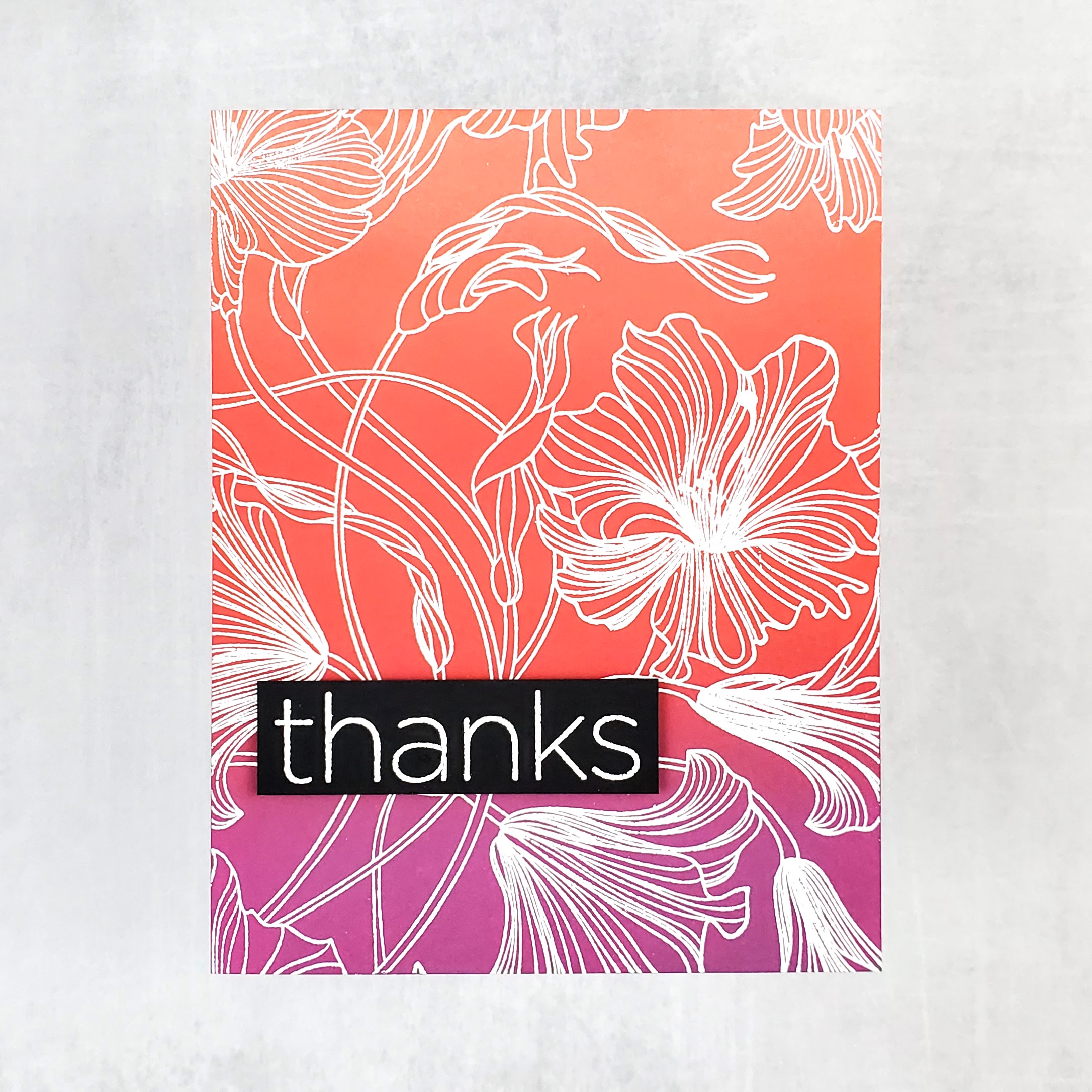
I had started with an A2-sized panel of Strathmore Bristol Smooth cardstock, foam blending tools, and three colors of Distress Oxide inks: Seedless Preserves, Crackling Campfire, and Abandoned Coral. I blended Seedless Preserves at one end of the card and then added Crackling Campfire in the middle. I went back and forth with the two colors where they overlap, using circular motions to get the initial blend, and then switching to tamping motions to get an even more seamless blend. Then I added Abandoned Coral at the top of the card and used the same process to blend it into Crackling Campfire.
Because Seedless Preserves is so different from the other colors, it felt like I needed more contrast between the top two colors. I ended up tamping on some Tattered Rose to try to lighten the very top.
After a week, I came back to the panel and used Wow! Embossing pad and white Hero Arts Embossing powder to heat emboss the Harmonious Hibiscus background stamp from My Favorite Things.
Next, I heat embossed the sentiment, which is from the Simon Says Stamp + CZ Designs Clean Lines Gratitude stamp set, onto black cardstock.
To assemble the card, I used foam tape to adhere the sentiment to the background and then I adhered the card front to an A2-sized card base.
Thank you so much for visiting!

I think the smooth contrast is absolutely stunning
LikeLiked by 1 person
Beautiful ink blending, gorgeous card!
LikeLiked by 1 person